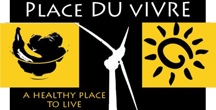
There are 3 types of logos:
1) Font-based logos - logo using text to represent the company.
2) Graphic logos - Includes a graphic that is usually symbolic of what the company
does, includes text.
3) Illustrative logos - logo that defines what the company does.
A logo, should be well thought out and planned, since it is often the first perception of a company and can make a lasting impression. A logo should focus on four areas: shape, presence, weight and contrast. It should be unique, yet remain simple.

Solara Lofts- Is a solar energy condominium complex.
Solara’s logo:
• Is in the graphic logo catagory. It uses three colors for simplicity and contrast - blue, white and yellow. Blue, which symbolizes honesty and calm is used for the background. Yellow, which depicts cheerfulness, is used for the 3 circles. White, which evokes serene feelings, was used for the text.
• Uses the same font but in two different sizes for contrast. Uses vertical or stacking orientation for placement of text. Has a good presence with both the text and graphic design filling the area designated for the logo and clearly identifying the company. It looks balanced.
• Strengths: The logo is able to communicate with the graphic of the yellow circles the concept the business being affliated with solar energy. Its name is strong as it reflects the concept of the business. It uses text to identify what type of business it is (lofts).
• Weaknesses: The logo really doesn’t differentiate itself from the mass of logos that are on the market. Its selection of colors are not bold, but soft with a pale blue and yellow.

Tower Lofts - Are energy efficient lofts that were created in a landmark warehouse.
Tower’s logo:
• Is a graphic logo. The tower and cloud is symbolic of the tower being a “sky dock”, which rises above the rest of the building and provides a place to enjoy panoramic views of the city. The graphic of the tower and cloud presents a very recognizable, although not unique shape for a logo.
• Utilizes 3 basic colors, white, sky blue and black, to create strong contrast and simplicity.
• The same font and font size is used for text and it is placed vertically stacked.
• Strengths: The logo is simple, using negative space and line, to represent the business. It presents a balanced image with presence. The black and white contrast is eye catching, with the blue cloud emphasizing the height of the tower. The logo is very related to the name and the business.
• Weakness: The logo really doesn’t give much insight that the building is historical or that green design is a focus for the lofts.

Park Place on the River - is a complex of 2 and 3 bedroom rental condominums.
Park Place’s logo:
• Is a font based logo. The logo uses the text to identify and rerepresent the company.
• Two colors, white and green, were used to create a bold contrast and strong presence. Green, which is identifiable with the words peaceful and harmony, was used for the background.
• White was used for the two different fonts. A more formal font style was used for the condo name and for the subscript to create a image for the building that will be seen as elegant. It will also help make it more identifiable.
• Text was oriented vertically.
• Strengths: The placement of the text is kept simple, yet presents a balance and elegant presence.
• Weakness: It is not really unique. There are other condominiums and hotels named Park Place.


No comments:
Post a Comment