Friday, January 23, 2009

Site Visit - Fresh Market


On Saturday, January 17th, I made a second site visit to The Fresh Market- 10555 Perkins Road. My purpose for the visit was to speak with the manager to get a better understanding of the store's actual retail square footage. I also wanted to check some of the measurements that I took on my first visit and see if there was anything that I might have missed. The manager, Vicor Dupre, said that the store's retail space was approximately 8,800 sq. ft. with another 24,000 sq. ft being dedicated to storage, coolers/freezers and office space. He also confirmed the preference for neutral warm colors, such as red, browns, beige and cream, in their company's store design. The store did have public restrooms in the front of the store that were gender specific and ADA. There was not a designated customer service area. Victor said that they have the manager paged when needed.

Grocery Store Inspiration - Eataly


http://www.eatalytorino.it/eatalytorino/welcome_eng.lasso

The Biggest Food and Wine Center

The ambitious new Eataly project is taking life in Turin: A food and wine center where visitors can buy, taste and learn about high-quality food and drink.

In the heart of the city, near the Lingotto convention and shopping center, you can find all the sustainably priced Eataly products on display in a vast marketplace. This is much more than just a food store. Our products are closely tied to their own history, culture and true flavor, within the reach of everyone who is interested in deepening their understanding of good, clean and fair food.

Meeting with Alecia Weichers, Committee Member

I have been corresponding with Alecia Weichers since about mid-September through email on various aspects of the project. Her input has been very helpful as she not only works as a designer, but works downtown and is in the age group that my project is trying to appeal to. Last Thursday, we had a meeting where we discussed what Alecia would like to see in a grocery store or loft. She had a preferrence for a more natural environment (use of wood, crates, soft natural colors, etc) for the grocery store. My French Market concept fits well with her suggestions.

Logo - Personal Logo Developement


Logo Design 1 - In the first 2 designs, I used a either blue or green with white to create contrast, with yellow as an accent to balance the design. In the 3rd design, I used yellow and green with white as the accent to create a more subtle contrast. Text and graphics were placed horizontally in all 3 designs. Graphics were used to symbolize alternative energy. The shape of the design would not be considered unique.


Logo Design 2 - In the first 2 designs, I used a combination of green, black and white to create contrast and balance. In the 3rd design, I used black and white only to create a sharper contrast between the text and images and a more balanced logo. The 4th logo was created predominately using green and black with white as an accent for the same effect as logo 3. This logo could be considered having a unique shape with the windmill inset in the black square which could symbolize the building. All 4 designs were created using horizontal and vertical placement of images/text.


Logo Design 3- All 3 logos were created using a combination of black and yellow with white as an accent to create a very strong contrast and bold image. The 3rd logo (larger logo) with the bolder windmill is a more effective logo as it is more balanced and has a stronger presence. There is not a unique shape to the logo by itself, but the combination of the three graphics could become recog-nizable for Place du Vivre without any text.

Thursday, January 22, 2009

Logo Design - Developement Research

What is a logo? According to the article “A Logo Today” by Catherine Perrry, “The logo of a company is the shortest and most precise form to express the individuality, judgment, image and intention of a person or a company. Often people identify a particular organization by its logo. It is short, smart and has an immediate appeal to the clients of a company.”

There are 3 types of logos:

1) Font-based logos - logo using text to represent the company.

2) Graphic logos - Includes a graphic that is usually symbolic of what the company
does, includes text.

3) Illustrative logos - logo that defines what the company does.

A logo, should be well thought out and planned, since it is often the first perception of a company and can make a lasting impression. A logo should focus on four areas: shape, presence, weight and contrast. It should be unique, yet remain simple.
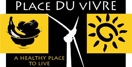


Solara Lofts- Is a solar energy condominium complex.

Solara’s logo:

• Is in the graphic logo catagory. It uses three colors for simplicity and contrast - blue, white and yellow. Blue, which symbolizes honesty and calm is used for the background. Yellow, which depicts cheerfulness, is used for the 3 circles. White, which evokes serene feelings, was used for the text.

• Uses the same font but in two different sizes for contrast. Uses vertical or stacking orientation for placement of text. Has a good presence with both the text and graphic design filling the area designated for the logo and clearly identifying the company. It looks balanced.

• Strengths: The logo is able to communicate with the graphic of the yellow circles the concept the business being affliated with solar energy. Its name is strong as it reflects the concept of the business. It uses text to identify what type of business it is (lofts).

• Weaknesses: The logo really doesn’t differentiate itself from the mass of logos that are on the market. Its selection of colors are not bold, but soft with a pale blue and yellow.


Tower Lofts - Are energy efficient lofts that were created in a landmark warehouse.

Tower’s logo:

• Is a graphic logo. The tower and cloud is symbolic of the tower being a “sky dock”, which rises above the rest of the building and provides a place to enjoy panoramic views of the city. The graphic of the tower and cloud presents a very recognizable, although not unique shape for a logo.

• Utilizes 3 basic colors, white, sky blue and black, to create strong contrast and simplicity.

• The same font and font size is used for text and it is placed vertically stacked.

• Strengths: The logo is simple, using negative space and line, to represent the business. It presents a balanced image with presence. The black and white contrast is eye catching, with the blue cloud emphasizing the height of the tower. The logo is very related to the name and the business.

• Weakness: The logo really doesn’t give much insight that the building is historical or that green design is a focus for the lofts.


Park Place on the River - is a complex of 2 and 3 bedroom rental condominums.


Park Place’s logo:

• Is a font based logo. The logo uses the text to identify and rerepresent the company.


• Two colors, white and green, were used to create a bold contrast and strong presence. Green, which is identifiable with the words peaceful and harmony, was used for the background.

• White was used for the two different fonts. A more formal font style was used for the condo name and for the subscript to create a image for the building that will be seen as elegant. It will also help make it more identifiable.

• Text was oriented vertically.

• Strengths: The placement of the text is kept simple, yet presents a balance and elegant presence.

• Weakness: It is not really unique. There are other condominiums and hotels named Park Place.

Meetings with Alexis Bounds - Grocery Store Mentor

My mentor for the Grocery store portion of my project is Alexis Bounds, Store Planning and Design Specialist for Associated Grocers. Her experience and insight with grocery store planning has been invaluable as she is very up-to-date with current industry trends. There also is very little available to the public on grocery/supermarket planning and design. I have met with Alexis three times since October with one being a site visit to Fresh Market. I have been corresponding regularly with Alexis since September by email and Alexis has sent numerous emails to me with links to suppliers, equipment and industry news.

At our last meeting, Alexis and I discussed the color trends that grocery stores are leaning towards and which stores have had success with these colors. I want to design my grocery store, which is a fresh market, around a "French Market" design theme. The current industry colors, which are earthy and natural, will work well with this concept. My inspiration for this idea came from a grocery store in Canada name Eataly.

Tease the Senses

According to Mark Lanini of Landini Associates, "food shopping is a sensual experience and canny designers create retail environments that tease the senses". He also state that people "shop with their senses"..."taste this, squeeze that, fill your lungs with the aroma and feast your eyes".

Project Goals

• First - to provide affordable housing for city workers and other residents, while revitalizing the downtown Baton Rouge area. This housing would appeal to young workers between 20 and 30 years old who prefer an active city life to the quiet suburb life and empty nesters who want to live near good restaurants, museums and cultural events.

• Second – to provide a grocery store that is convenient to the residents of the building and other city residents.

• Third – to provide short-term housing for city visitors who are either in Baton Rouge for business or visiting family. One floor would be allocated to these extended stay units with leases running from a week to three months.

• Fourth – To provide each resident a dedicated parking place in the building. These parking places will have secure access (gated). There will be a few parking spaces allocated to the Extended Stay guest.

• Fifth – Follow sustainable and universal design practices were applicable and when possible. Incorporate green energy such as solar and/or wind energy.

Design Problem.

There is a shortage of affordable housing downtown due to past urban planning and development policies, which favored residential growth that moved away from the city’s core. This urban sprawl created traffic congestion and contributed to existing air pollution. Recent environmental and economic concerns added to this problem with the cost of gas rising and concern over limited natural resources being raised. A drive towards residential development downtown is being actively promoted in order to bring life back to the city and to help contain the urban sprawl. This is appealing to many city workers who want to spend less time traveling between their homes and other destinations. My project addresses this problem by providing affordable residential housing downtown and creating businesses, such as a grocery store, that will support the community and aide the downtown's revitalization efforts.

Inspiration

Two events this past summer shaped my choice for my Senior Capstone Project. The first event was my father and brother each having strokes and losing their abilities to drive. This greatly affected their quality of life as they are now dependent on other people to get to needed destinations such as the grocery store, doctors, bank, etc. I began to think about Baton Rouge’s residential communities and our suburban sprawl which has created traffic congestion and pollution. Our way of life is very dependent on owning a car, especially with Baton Rouge’s limited mass transportation system. In addition, I found that those who were able to get around via their own vehicle, spent too much time in traffic creating stress and vehicle related expenses.
The second event which shaped my Senior Capstone Project was Hurricane Gustav and the current focus on our global energy and environment problem. I was already interested in residential solar energy prior to Hurricane Gustav …but Baton Rouge’s lengthy power outage intensified this interest. I felt that there had to be a more efficient and economic way to produce energy for our homes and businesses. Power companies are now offering grid systems that allow extra power to be stored and sold back to the power companies for profit, thus allowing individuals to produce their own energy and make money.

I became aware of smart growth communities and the "town center" concept that was springing up across the country. Digging a little further, I also became aware of a movement to create mixed residential areas through adaptive reuse of already established buildings.

My Personal Design Philosophy


In today’s global world, boundaries between work and home have been blurred and overlap personal spaces and time. Americans, especially, spend too much time surrounded either by interior walls or the inside of their car, while traveling between work, home and other destinations. They do not get to spend a lot of time outdoors. I enjoy creating organic and sustainable spaces that bring the outside into the inside, either visually or mentally. I also like merging interior space with exterior space thus expanding indoor living to the outdoors.

I believe that a good design should evolve not only from the client’s needs, but also from the surroundings of where the space is to be created. Materials and finishes should be selected that reflect this environment and reinforce it. I am partial to incorporating multiple or large windows in my designs to frame nature and/or to utilize natural daylight as much as possible. I feel that some of the best art that you can add to a space is from nature and nothing can match its color or vibrancy. Like Frank Lloyd Wright, I like to repeat elements throughout a design and believe that a design should flow from the inside to the out, integrating the building and its furnishings with its surroundings.