Logo Design 1 - In the first 2 designs, I used a either blue or green with white to create contrast, with yellow as an accent to balance the design. In the 3rd design, I used yellow and green with white as the accent to create a more subtle contrast. Text and graphics were placed horizontally in all 3 designs. Graphics were used to symbolize alternative energy. The shape of the design would not be considered unique.
 Logo Design 2 - In the first 2 designs, I used a combination of green, black and white to create contrast and balance. In the 3rd design, I used black and white only to create a sharper contrast between the text and images and a more balanced logo. The 4th logo was created predominately using green and black with white as an accent for the same effect as logo 3. This logo could be considered having a unique shape with the windmill inset in the black square which could symbolize the building. All 4 designs were created using horizontal and vertical placement of images/text.
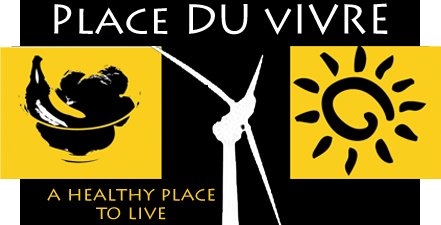
Logo Design 3- All 3 logos were created using a combination of black and yellow with white as an accent to create a very strong contrast and bold image. The 3rd logo (larger logo) with the bolder windmill is a more effective logo as it is more balanced and has a stronger presence. There is not a unique shape to the logo by itself, but the combination of the three graphics could become recog-nizable for Place du Vivre without any text.


No comments:
Post a Comment